
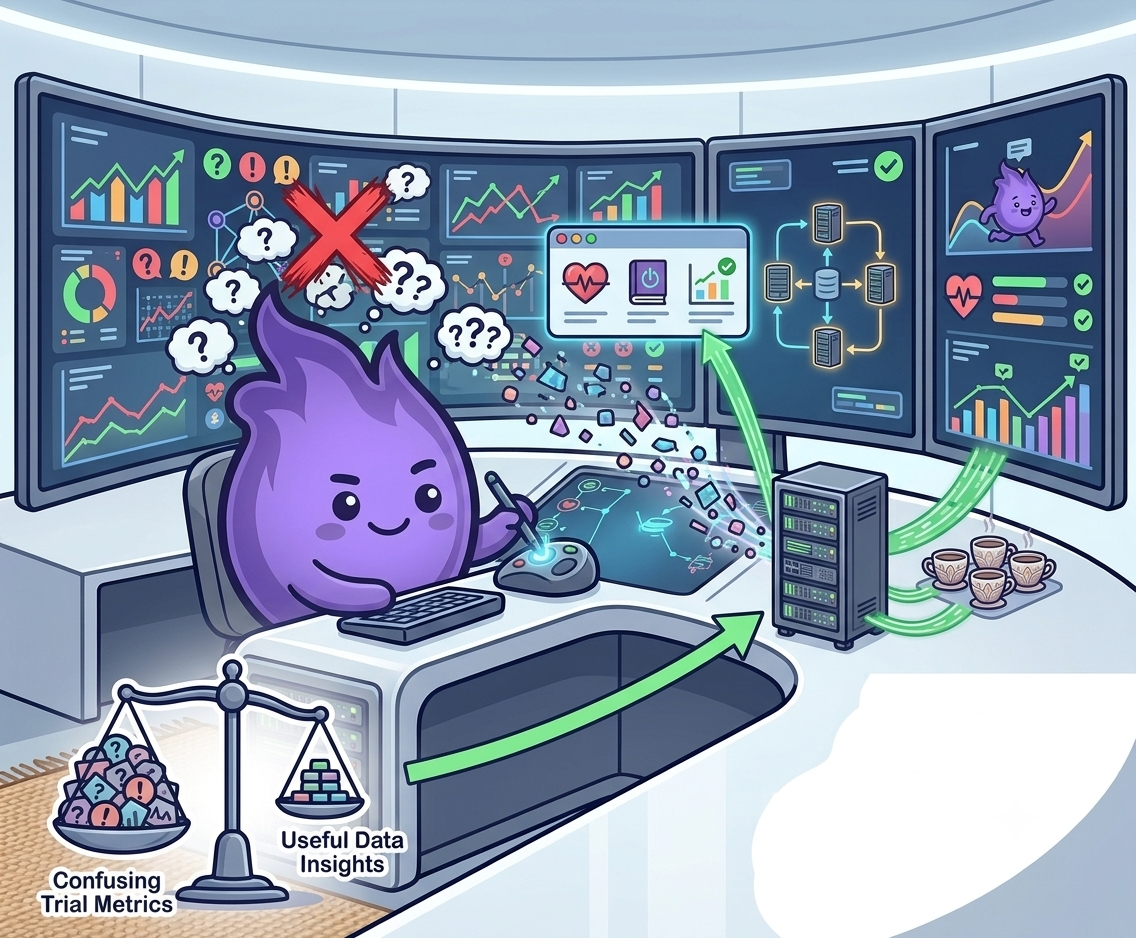
Why not all trial dashboards are actually useful
A dashboard should help you do your job. In many trials, it does not. Sponsor and CRO dashboards are often bloated, visually busy, and built more for presenting status than for guiding action, which is a subtle but important distinction. A status dashboard answers "where are we?" A decision dashboard answers "what do I need to do next?" Most tools default to the first because it's easier to build, and most teams don't notice the gap until they're three months into a study still manually cross-referencing spreadsheets to answer questions the dashboard was supposed to make obvious.
What goes wrong
Too much data, too little signal. It is easy to put everything on a dashboard: recruitment numbers, compliance rates, site queries, missing visits, ePRO completion, protocol deviations. When every metric is visible, none of them stand out. Prioritisation is not just cosmetic. It is what makes a dashboard useful.
Misaligned time frames. A dashboard showing only the past 30 days may hide a trend that only becomes visible across quarters. Others focus on day-to-day blips that distract from long-term trajectory. The right window depends on what decision the dashboard is meant to support.
Metrics without context. Seeing 68% compliance is not useful unless you know what is considered acceptable for this study, how that compares to other sites, and whether the number has been going up or down.
No clear owner. If nobody is responsible for interpreting and acting on the data, the dashboard becomes wallpaper. Numbers that do not lead to a decision or an action are not a feature. They are noise.
That last failure mode isn't hypothetical. A four-year implementation study at a National Cancer Institute-designated cancer center tracked what happened when static spreadsheets and manual monthly reports were replaced with a near-real-time accrual dashboard used institution-wide. It logged 1,605 unique user sessions across investigators, coordinators, data managers, and leadership, and the dashboard was genuinely adopted into routine operational reviews rather than sitting unused. But the path there wasn't immediate: the study reported an initial spike in data correction workload and user resistance, which only settled as workflows matured and the team got used to working with transparent, continuously updated numbers instead of a monthly snapshot.
The primary value of such systems lies not only in visualization or analytics but in their ability to shift accrual monitoring from retrospective reporting to proactive, institution-wide operational review. Pepper et al., near-real-time accrual dashboard implementation study
A dashboard that surfaces more of the truth, more often, tends to create friction before it creates value.
What a useful dashboard does differently
- Highlights what needs action first. Not "here is your data" but "three sites are below threshold, click to review queries."
- Compares meaningfully. Site A against Site B. Current phase against prior. Target against actual. Relative comparisons prompt action faster than static numbers.
- Allows drilldown without asking someone else. You should not need to email the data manager just to get the underlying table. Click, filter, or export directly.
- Works across devices. It should be usable on a large monitor and on a laptop screen. Build for the person using it, not for the person presenting it.
- Forecasts rather than just reports. The cancer centre dashboard above paired its live accrual numbers with forecasting models, used not to dictate decisions but to support anticipatory planning: flagging a lagging study before it became a crisis rather than confirming it was lagging after the fact.
Role-based views help significantly
A site coordinator and a sponsor lead need different information, and trying to serve both from one generic view is usually where dashboards start to sprawl:
| Role | What they actually need | Typical view |
|---|---|---|
| Site coordinator | What's due today and what's overdue | Task completion, overdue visits, participant issues |
| Sponsor lead | Whether the study is on track overall | Aggregate metrics, data quality trends, regulatory alerts |
| Data team | Where the underlying data is breaking down | Outliers, missing values, form timing patterns |
When people only see what is relevant to them, they act faster and with more confidence. This was one of the design choices behind the cancer centre's dashboard too: role-based access wasn't an afterthought bolted on for permissions purposes, it was part of why the tool got used rather than ignored. A single dashboard trying to serve everyone usually serves nobody particularly well.
Show less. Show clearly. Show what matters. And build in the expectation that adoption takes a few bumpy weeks before it becomes the thing your team actually checks first.