
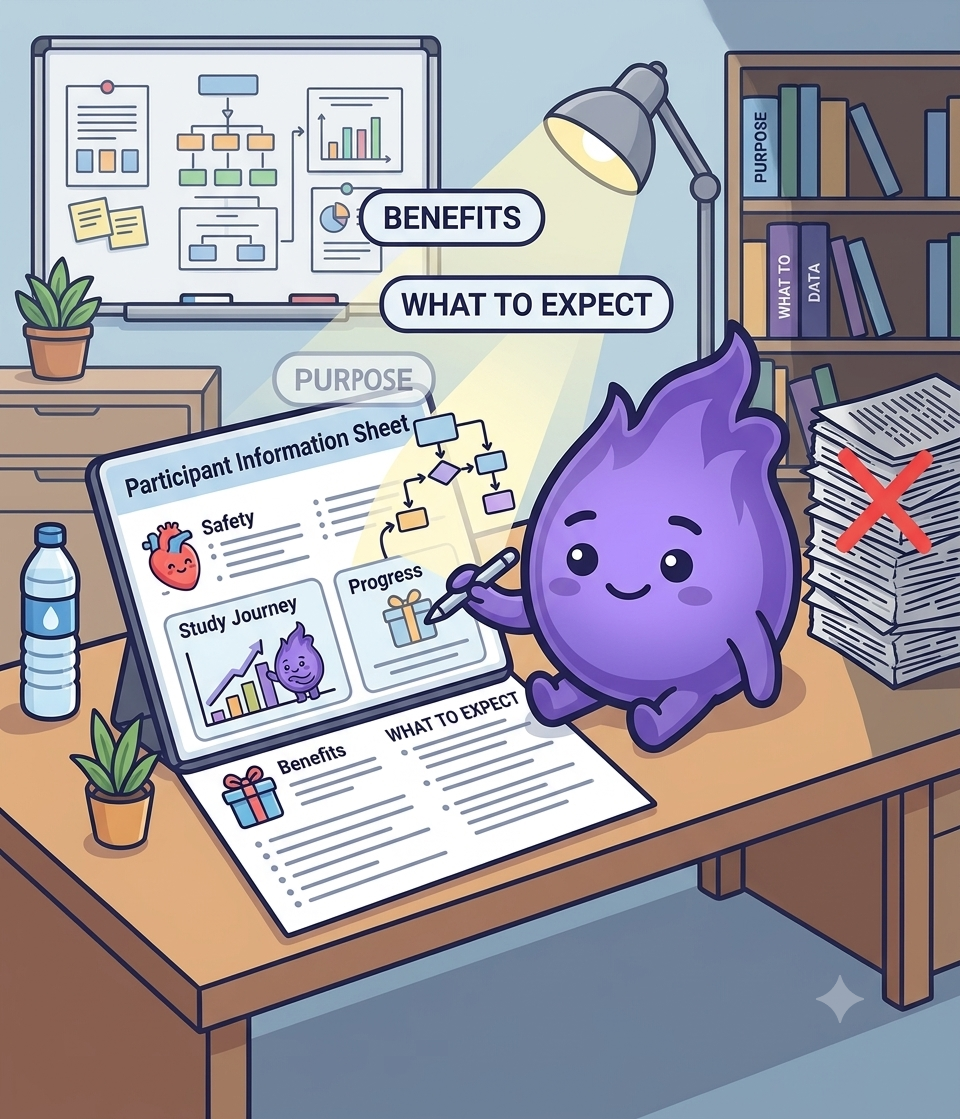
Making participant information sheets clearer and more useful
There is a quiet tension in clinical research. The participant information sheet (PIS) is one of the most important documents in any study. It is also one of the most likely to be skimmed or misunderstood.
Ethics committees require them. Participants receive them. But how much of the content is genuinely absorbed, and how much of it meaningfully informs consent? The gap between requirement and comprehension is larger than most study teams assume. An assessment of 86 real patient education documents from two professional urogynaecology societies found an average reading level of grade 9.9 to 10.5, despite the NIH recommending patient materials stay at or below a sixth-grade reading level. That's not a small miss. It's nearly double the recommended level, in documents written specifically to inform patients.
Why PIS readability matters
The PIS is often a participant's first real impression of a study. If it is too long, full of medical jargon, or formatted like a contract, the effect is not just confusion. It is discouragement.
In digital trials, where participants might receive everything by email or through an app, there is often no face-to-face explanation to fill in the gaps. That makes clarity on the page, or on the screen, even more important. This isn't just a hunch either: focus group research with patient representatives reviewing real cancer trial information leaflets found their responses fell into two clear categories, emotional responses (driven by individual preferences and perceptions of risk) and cognitive responses (driven by comprehensibility and layout), and the participants' own top recommendation was consistent: simplify the language, structure the text, and use illustrations.
Common pitfalls to avoid
- Overly technical language. "Adverse event" might be clear to a regulator but not necessarily to a 20-year-old joining a probiotic study.
- Dense blocks of text. Long paragraphs with no visual breaks are off-putting before anyone has read a word.
- Assumed familiarity. References to procedures without explanation ("You will complete a 24-hour recall on Day 7") assume more context than most participants have.
- Trying to cover everything in one pass. Front-loading all information at once guarantees that most of it will not be retained.
What actually helps
- Chunking. Break text into manageable sections with descriptive headings so readers can navigate to what matters to them.
- Plain language. Write as if explaining to a smart non-expert. That is often who is reading, and the readability research above suggests most patient materials are still written for a reader several grade levels above that.
- An overview first, detail available on request. Provide the essential picture, then offer deeper explanations through expandable text or a separate section for those who want it.
- Visual aids. Timelines, flowcharts, and simple icons can make the structure of a study far clearer than paragraphs of text, echoing exactly what patient representatives asked for when reviewing real trial leaflets.
Digital-specific things to consider
When a PIS is delivered through a participant portal or app, the format itself becomes part of the readability problem or the solution:
| Consideration | Why it matters |
|---|---|
| Mobile-friendly layout | No one wants to scroll through a densely formatted PDF on a phone screen |
| Time-on-page as a signal | Not to judge participants, but to see which sections are consistently glossed over and worth rewriting |
| Progressive disclosure | Showing a few sections at a time avoids confronting readers with everything at once |
| Consistent terminology across the app | A term explained once in the PIS but phrased differently later in the app recreates the same confusion in a new place |
What this means in practice
Some participants read the PIS carefully. Others skim. A few skip straight to clicking "next." But a well-written, well-structured PIS raises the proportion who genuinely understand what they are agreeing to, and the evidence suggests most current materials have real room to improve on that front rather than being close to a ceiling already.
That matters beyond compliance. Informed participation is more reliable participation. And in a remote study where trust has to be built through screens rather than conversations, the quality of that first document sets the tone for everything that follows. A reading level pitched two grades too high isn't a stylistic quibble. It's the first thing standing between a participant and actually understanding what they've agreed to do.