
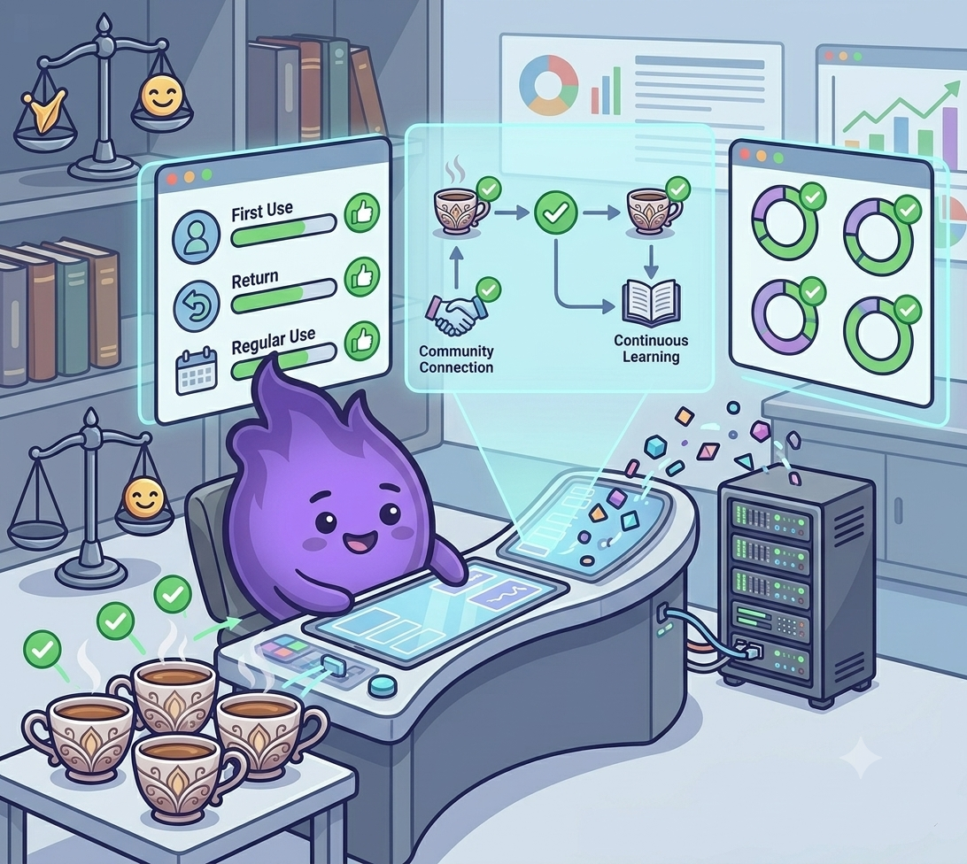
App retention strategies
Participant-facing apps play a central role in decentralised trials. But designing them to support retention, without crossing into manipulation or fatigue, is a quieter challenge than it might appear.
Too many nudges and participants disengage. Too few and they forget. Somewhere in between is a design that actually helps people stay involved, and the honest news is that nudges alone don't do most of the work.
A large longitudinal study of a behaviour-change mHealth app tracked 22,797 participants over 78 weeks and found that, on average, 70% sat in an inactivity state gaining nothing in a typical week, while only 12% were consistently highly engaged. Periodic email prompts helped, but modestly: receiving and opening an email raised the likelihood of becoming active that week by about three percentage points, and only when the email matched the programme's actual goal. Messages that drifted off-topic, even mild promotional ones, were met with resistance rather than action. The lesson isn't that reminders don't work. It's that most of a study's retention problem sits somewhere other than the notification settings.
Start with the right intent
Retention is not about coercion. It is about support. The goal is to:
- Help participants remember their tasks without overwhelming them
- Remove friction wherever it appears in the experience
- Keep them informed without creating noise
This shifts the focus from engagement tricks to practical, respectful design, and it lines up with what the research above actually found: broad, generic prompting has a ceiling, and what happens around the prompt, whether it's on-topic, well-timed, and honestly framed, matters more than how often it fires.
What actually works
Clarity up front. Participants should know from the start what they will be asked to do, when tasks will appear, and roughly how long each one takes. Surprises create friction. Predictability builds trust.
Confirmation, not just reminders. It is easy to notify someone that a task is due. What keeps people going is feedback when they complete it:
- "Your entry was saved"
- "That was your final task for this week"
- "Thanks, that completed this phase"
These feel small, but they mark progress and reinforce the sense that the effort is going somewhere. That sense of visible progress isn't just a nice-to-have. A longitudinal analysis of over 2,000 participants in a digital mental health study found that people who perceived clinical improvement during the study showed meaningfully better adherence and retention, even when they had started out more unwell than average. Participants who could see they were getting something out of their participation stayed. Participants who couldn't see any change were the ones most likely to drift away before completing a single follow-up questionnaire.
Visual progress indicators. A subtle progress bar, a ticked checklist, or a phase label all tell the participant they are not stuck in an endless loop. The study has a shape. They can see where they are in it, which does for the whole study what a single "your entry was saved" message does for one task.
Visible support. One tap to reach the study team. No buried help menus. No generic FAQs that do not answer the actual question. When people know they can get help quickly, they are more likely to stay.
Design for interruption. People get called away. Phones die. Apps close unexpectedly. Make it easy to resume exactly where someone left off, without losing progress or having to restart a form.
What to avoid, and why it backfires
Not every nudge is neutral. Some actively cost you trust, and the mechanism behind each one is usually the same: it signals that the app is optimising for its own metrics rather than the participant's actual experience.
| Habit | Why it backfires |
|---|---|
| Daily push notifications for weekly tasks | Trains participants to ignore notifications altogether |
| Visual noise (badges, animations, sounds) without real meaning | Adds stimulation without helping anyone understand their progress |
| Gamification that doesn't fit the study's tone | Feels manipulative in a context participants take seriously |
| Surveys appearing without explanation | Reads as arbitrary rather than purposeful, and invites suspicion rather than compliance |
Every one of these fails for a version of the same reason the off-goal marketing emails failed in the large mHealth study cited above: participants can tell the difference between a message that serves them and one that serves the programme's engagement numbers, and they respond accordingly.
Participants are not customers. They are collaborators. Treating them with clarity and respect, and giving them real, honest signals that their effort is going somewhere, keeps more people engaged than any points system or streak counter ever could.